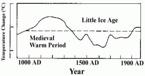
When the IPCC came out with it's first report it presented a proxy reconstruction of past temperatures that showed the climate of the Medieval Warm Period to be warmer than today. As they quickly figured out, they had presented a chart that was counterproductive to their objectives. It's hard to stampede the population of the earth, for UN profit and power, when the thing that you are warning about has happened so recently to no ill effect. This was one of the first inconvenient truths that the IPCC need to disappear in order to achieve their goals. The people who rode to their rescue were Michael Mann and many of the climategate decline hiders from the CRU. These people found that data series could be cherry picked, data series could be used upside down, and analysis methods could be used to torture the data into confession. They presented their first major gift to the IPCC, they disappeared the MWP and they filled their own coffers with research grants. It no longer mattered that history described farming in Greenland; grape growing where it had not happened before or since; an LIA that froze the Thames; that other reconstructions from all over the world showed a major MWP overlapping at 1000 AD. None of it mattered. The IPCC declared that peeeerrrr rrreeevied papers, published in major scientific journals, had made the MWP and the LIA just figments of our imagination.
In the period since then there have been many inconvenient truth that needed to be discredited for the benefit of the IPCC. And there have always been volunteers. If a scientist published a paper that questioned some aspect of the IPCC orthodoxy the attack dogs from web sites like Real Climate, Open Mind, and Climate Progress were waiting with personal attacks and buckets of mud to slag off the work. The climategate gang was waiting to prevent the publication of such papers, or, failing that, to publish negative responses to the work. The quality, seriousness, or scientific applicability of the criticism never really mattered. What was important was that there was a reference available that allowed the AGW sycophants to claim, "oh, that paper has been debunked".
The latest inconvenient truth that needs to be disappeared is the 12 year trend of no warming in the planet's surface temperature. The IPCC and the politicians are hearing about this often now - and they don't like it. With each year that comes and goes with the trend still flat the voices of AGW dissent get louder and the need to disappear it gets more urgent for the AGW cabal. The evidence for this lack of warming is presented in the post below. Once again, we have people riding to the rescue of the IPCC. In this case those people are David Easterling of NOAA and Michael Wehner of the Lawrence Berkeley National Laboratory. Their paper has been submitted to Geophysical Research Letters for publication.
The objective of this post is to review some of the reasons that these authors wish to discount the current flat temperature trend. Given that their objections are very similar to ones that can be found on many of the AGW support web sites, the post will hopefully answer some of those issues as well.
Before I begin on the paper, I should note that there are many in the blogosphere that even deny that a flat trend currently exists. The authors only make this claim in an oblique way, concentrating instead on what they consider to be the unimportance of the trend.
Easterling and Wehner state:
"We show that the climate over the 21st century can and likely will produce periods of a decade or two where the globally averaged surface air temperature shows no trend or even slight cooling in the presence of longer-term warming."
They then try to show the existence of such periods by using both surface temperature data and model output. First, concerning the surface temperature, they make this claim:
"However, if we fit a trend line to the same annual global land-ocean temperatures for the 1977-1985 period or the 1981-1989 period we also get no trend, even though these periods are embedded in the 1975-2008 period showing a substantial overall warming."
First, note that both of their periods are not the "decade or two" long that they claim. Rather they are both only 9 years long. I decided to plot these supposed flat trends for myself to see how they looked. The first period, 1977-1985 (see figure 1) was reasonably flat, but slightly positive. The second period, 1981-1989 (see figure 2) was hardly flat at all. And the part of their statement that specified "or even slight cooling", was definitely not to be seen. The data that I used for my check plots was HadCrut3v. As it happened, I also had an ENSO corrected set of HadCrut3v data available. This data set was generated for this paper by D. Thompson et al. And it was stored on the Real Climate web site. Unfortunately it only runs through May 2008. But it will still serve our purpose. I wanted to see if either of these periods from Easterling and Wehner were flat as a result of being artifacts of ENSO. As we can see, the first period, in figure 1, was slightly flattened by ENSO. Without ENSO the trend becomes more pronounced. But the second period was strongly influenced by ENSO, as can be seen in figure 2. I decided to get a feel of what the trend for that period was, and so I produced a 20 year chart from 1975 to 1995. This period is in the heart of the time where most warmers believe that the AGW signal was clearly revealed.

Easterling & Wehner Fig 1

Easterling & Wehner Fig 2

Easterling & Wehner Fig 3
As we can see when comparing the slope numbers on the chart for figures one and three, the ENSO corrected data is one third of the longer trend's uncorrected data and it is fully one halve of the ENSO corrected longer trend. This hardly seems to me to be a justification for claiming that the first period has no trend.
Then, comparing figure 2 to figure 3 it looks like the ENSO corrected data from figure 2 actually shows a stronger trend than the main trend in figure 2. It is stronger than either the ENSO corrected or uncorrected trends of the longer period. Even the uncorrected data from figure 2 has 50% of the slope of the long term uncorrected trend. I hardly think that Easterling and Wehner are justified in calling the 1981-1989 period trend-less. Also, it becomes obvious that ENSO had a mild but noticeable effect on suppressing the trend for the first period; and a strong effect on suppressing the trend in the second period. This will become important shortly.

Easterling & Wehner Fig 4
We now move on to figure 4, which has the most current time period - also a flat trend. What do Easterling and Wehner have to say about the current flat trend:
It is true that if we fit a linear trend line to the annual global land-ocean surface air temperature (Smith et al. 2005) shown in Figure 1 for the period 1998 to 2008 there is no real trend,
and
The unusually strong 1997-1998 El Niño contributed to unusual warmth in the global temperature for 1998 at the start of this period resulting in only a small, statistically insignificant positive trend.
HadCrut3v shows no trend at all. HadCrut3v ENSO corrected shows a tiny amount of warming - much smaller than either of the 9 year samples that the authors give. And the difference between the ENSO corrected data and the non corrected data is actually much smaller than it is in either of the authors samples. The above quote, where they refer to the 1998 starting point, would seem to imply that the current flat trend is at least in part an artifact of ENSO and the choice of an ENSO starting point. But figure 4 shows that just the opposite is true. ENSO is less of a factor than it is for their examples. In fact the difference between the ENSO corrected data and the non ENSO corrected data is tiny. The general community of warmers are ready to grasp the excuse of the 1998 El Nino being the cause of the 12 year flat trend because it suits their purpose. If they would look closer, for only one moment, they would see that the 1998 El Nino was followed, only one month later, by a 25 month La Nina. The effect of these two on the slope of the trend line is basically to cancel each other out. That is why the ENSO corrected and uncorrected trend lines are so close.
Still, with all of this discussion, one could argue that the 1977-1985 period is somewhat flattened and that ENSO does not account for it. But what else happened during this period? Well, for one, El Chichon erupted in 1982. This is in the second half of the period and therefore any cooling that resulted would push down the slope of the trend. The massive quantities of volcanic aerosols most likely had a profound effect on the climate for the next 2 or 3 years. And one look at figure 1 for that period of time seems to confirm that assumption. So the flatness of the 1977-1985 period is most likely an artifact of El Chichon.
So we now have five reasons why the Easterling and Wehner examples do not constitute samples of the same kind of thing happening before within the crucial signal phase for AGW theory.
A. The current 12 year flat period is longer than their 9 year examples.
B. The current 12 year flat trend has less trend than their 9 year examples.
C. The current 12 year flat trend is not an ENSO artifact like one of their 9 year examples.
D. The current 12 year flat trend is not a volcano artifact like the other of their 9 year examples.
E. The current 12 year flat trend is open ended, whereas their 9 year trends are ended.
The last example is very important. In dealing with the 12 year flat trend one of the reasons for dismissing its importance is the expectation that it will not turn into a 20 or 30 year flat trend. The authors exhibit this expectation based on their forgone conclusion that AGW theory is correct and that AGW forcing will overcome the flat trend any day now. They don't consider the possibility of a small number for climate sensitivity and they don't consider the possibility of a long term component of natural variability that might be overcoming any AGW signal. These men clearly do not have an open mind on the AGW question. So how can they pretend to deal fairly with a subject that calls in doubt AGW - or at a minimum, the strength of AGW.
The next statement by Easterling and Wehner makes the discussion more interesting:
The reality of the climate system is that, due to natural climate variability, it is entirely possible to have a period as long as a decade or two of “cooling” superimposed on the longer-term warming trend due to anthropogenic greenhouse gas forcing.
Oddly enough, I agree completely with this statement. But the key word is "possible". The statement is not evidence that that is what is happening. Also it does not mean that there is a significant signal of greenhouse gas forcing that needs to be overcome. But if there were a strong AGW signal, then it is entirely possible for a natural element of variation to overcome it for some time period. But here is the million dollar question - what is the element of natural variation that has overcome the signal for the last 12 years? We know from figure 4 that the natural element of variation is not ENSO. We know that there are no significant volcanic events that account for it. And while solar is doing the right kind of thing to account for it, we also know that the variations in TSI are simply too small to account for it. So where do we find an element of natural forcing that is both strong enough to overcome a strong AGW influence and that we can identify as having been at work for the twelve year period. I have asked this question of climate scientists like Gavin Schmidt and there is simply no answer anywhere to be found. Apparently Kevin Trenberth doesn't know either when he makes the following statement here:
why is the temperature not continuing to go up? The stock answer is that natural variability plays a key role [1] and there was a major La Niña event early in 2008 that led to the month of January having the lowest anomaly in global temperature since 2000. While this is true, it is an incomplete explanation. In particular, what are the physical processes? From an energy standpoint, there should be an explanation that accounts for where the radiative forcing has gone.
Looking at the evidence, one must arrive at one of two conclusions. Either the AGW signal is not nearly as strong as is claimed by the IPCC; or there are strong elements of natural variation that are unidentified and undefined. If the former is the case, the AGW alarms need to be turned off. If the later is the case, then we cannot assume the continuation of the AGW trend at any particular time because we don't know what the cycle time for that natural element of variation is.
Easterling and Wehner spend a lot of their paper talking about Coupled Climate Model simulations; and how those simulations produce flat trends that are a decade long or longer. Frankly, I fail to see how climate model output is relevant to the discussion of real world variability. No CCMs have ever had their prediction capability validated, and many of them are now only hanging on by their error bars. In addition, the authors used a single run of a climate model, thereby increasing the variability of their data. Consequently, that portion of the paper has little interest for me and it has little relevance to the debate about the significance of the current 12 year flat trend.
There are, however, a couple of statements that they made in their discussion that interest me. For example, when talking about their model output:
Both of these periods show a small, statistically insignificant negative trend based on a simple least-squares trend line and there are other periods, such as the last seven years of this simulation, that show a similar lack of trend. This behavior occurs without any simulated volcanic eruptions or solar variability (natural forcing) that could result in a widespread cooling for some period of years and thus is presumed entirely due to natural internal variability.
What is the meaning of "natural" internal variability when speaking of a CCM. How is the output of a computer program "natural". What makes our authors believe that the elements of internal variability of a model are the same as the real elements of variability of global temperature in the real world?
Then Easterling and Wehner say this:
However, even considering these criticisms, it is clear that the models can and do produce sustained multi-year periods of “cooling” embedded within the longer-term warming produced in the 21st century simulations. Therefore, it is reasonable to expect that the natural variability of the real climate system can and likely will produce multi-year periods of sustained “cooling” or at least periods with no real trend even in the presence of longterm anthropogenic forced warming. Claims that global warming is not occurring that are derived from a cooling observed over such short time periods ignore this natural variability and are misleading.
If I may summarize what our authors are saying here, it is, "things happen for no reason". They want to tell us that "natural variability" can be a cause for the current flat trend, but they want to insist that the "natural variability" is some forcing that is simply random noise that we cannot identify. A person would have to be a complete fool to believe that the current global 12 year flat trend has no cause other than that thing are just kind of drifting around. It's shocking that people would make such a suggestion and still call themselves scientists. They are saying that the energy which should be being added to the earth due the increased radiative forcing is simply disappearing or hiding somewhere - who knows where.
Climate does not vary without a reason. Our authors seem to not understand the meaning of "natural variability". Natural variability are things like ENSO, PDO, AMO, volcanoes, solar, etc. Natural variability is not some unknown element of unidentified noise. Especially, it is not a 12 year global element of unidentified noise. While the argument against the significance of a 12 year period is applicable when we cannot know of the real natural elements of variability, this is not true for the current 12 year period. That period is in the history books. We can see the effects and account for them. When they are accounted for, the period of time needed for significance should be much reduced. The reason that the current period is so significant is because we cannot point to any natural elements of variability and say, "there is the reason that the trend is flat". This is in contrast to the periods given by the authors where we can easily do this. This is exactly the point that Trenberth makes in his paper. In the case of our authors their use of "natural variability" is simply so much hand-waving designed to get them to their foregone conclusion.
So let me repeat my central point here. The IPCC numbers for climate sensitivity are jeopardized by the fact that we cannot identify the elements of natural variability that are causing today's flat trend. This means that either the numbers are too high or that there are very strong elements of natural variability that we have not accounted for and that we have not modeled.